Sorry, this activity is currently hidden
Section outline
-

-
-

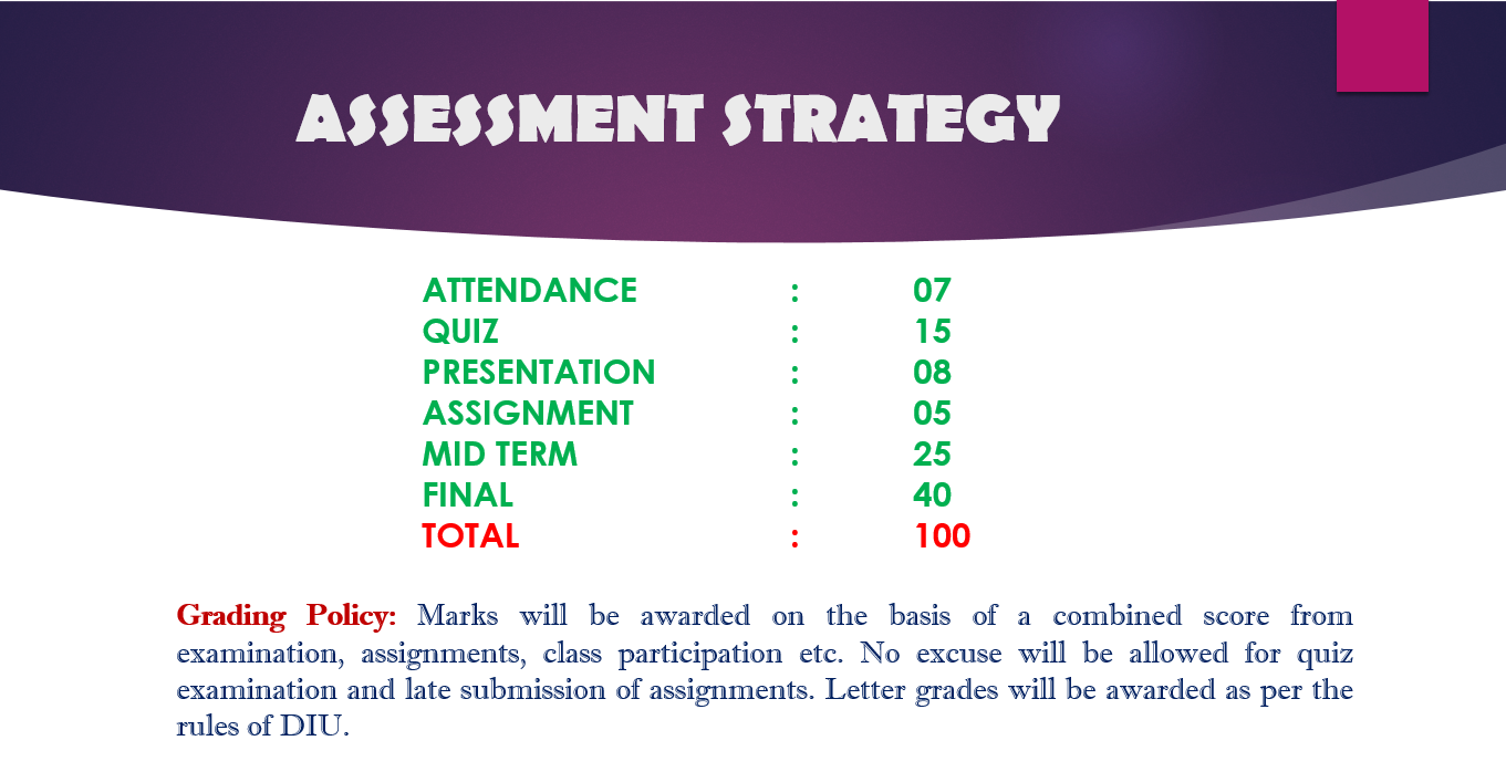
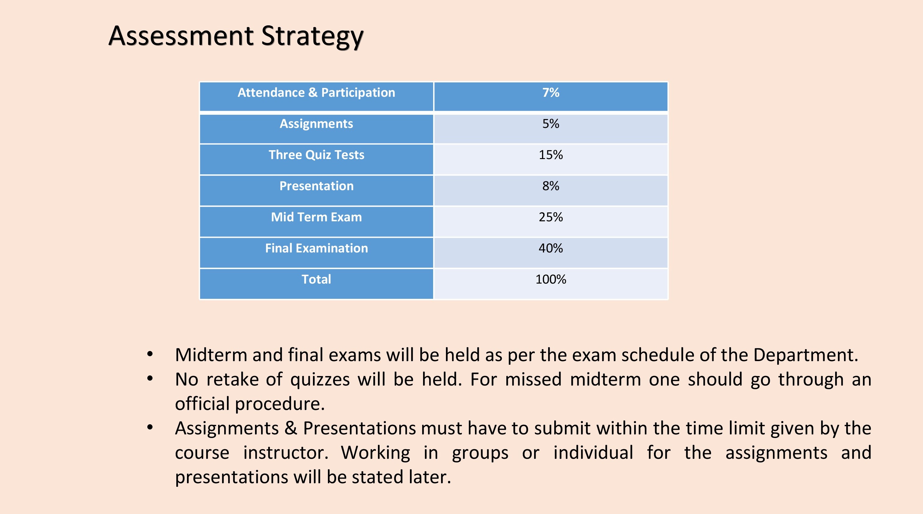
Marks Distribution:
All submitted assignment + Final Assignment + Class Participation = 5 marks
-
LEARNING OBJECTIVES ::
The objective of the lesson is to teach the students about the basic ideas of Data Presentation, Formation of Frequency Distribution Table, Histogram & Bar Diagram, Frequency Polygon, Percent & Relative Frequency, Frequenct Polygon & Ogive Curve etc.
LEARNING OUTCOMES ::
After successfully completing this lesson, students should be able to:
- Make a frequency table for a set of data
- Organize data into a bar chart
- Present a set of data in a pie chart
- Create a frequency distribution for a data set
- Understand a relative frequency distribution
- Present data from a frequency distribution in a histogram or frequency polygon
LECTURE CONTENTS ::
- Constructing A Frequency Table
- Constructing Frequency Distribution: Quantitative Data
- Relative Frequency Distribution
- Cumulative Frequency Distributions
- Graphical Presentation of Frequency Distribution
- Pie Chart
- Bar Diagram
- Histogram
-

-
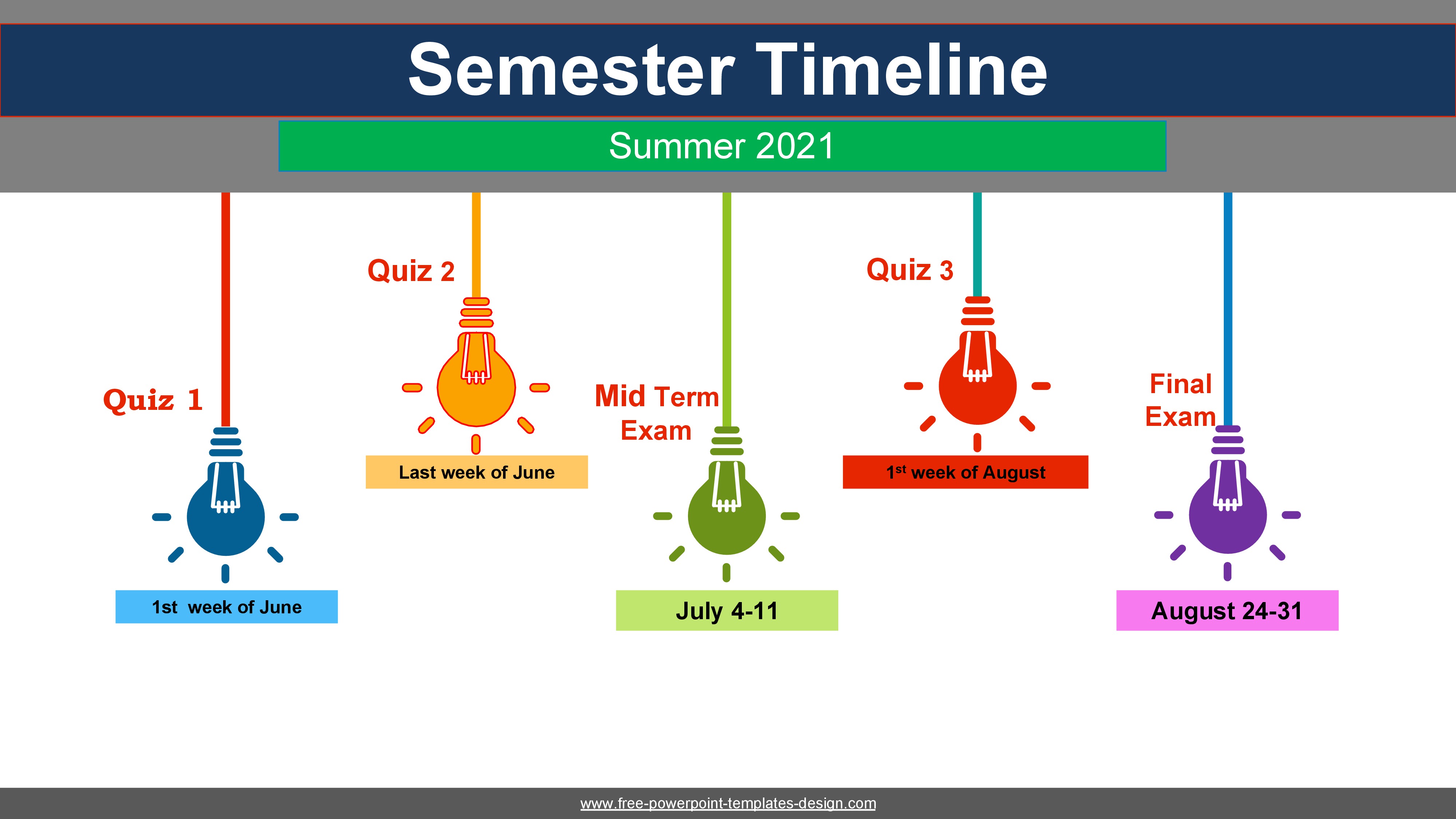
You have your 1st quiz on 19 June, 2021 (Saturday) at 10.00amYou will get 32 minutes to complete it.
best of luck my dear students!!
-
-
-
-
Course introduction
The aim of the subject is to provide the student with the basic statistical tools required to analyses data encountered in a wide range of managerial situations and make effective decisions based on this data.
Course Objectives:
In addition to specific learning outcomes, the course aims to shape the attitudes of learners regarding the field of Statistics.
1. Motivate the students an intrinsic interest in statistical thinking.
2. Instill the belief that Statistics is important for scientific research.
3. Provide a foundation and motivation for exposure to statistical ideas subsequent to the course.
Course Contents:
1. Basic concept of Statistics.
2. Frequency Distribution.
3. Measure of Central Tendency
4. Measures of Location.
5. Measures of Dispersion.
6. Skewness and kurtosis.
7. Correlation Analysis.
8. Regression Analysis.
9. Probability.
10. Probability Distribution.
11. Test of Hypothesis. -

Aims/Rationale
To teach the students about the basic concept of statistics and make them understand different types of variable. They can distinguish different types of variable so that they can use the knowledge in their academic and professional career or further research.Learning Outcomes: At the end of the session participant will be able to :
1. Understand the meaning concept and objective of statistics.
2. Differentiate different types of statistics and their preliminary function.
3. Can be able to distinguish between different types of data and identify different types of variable.
4. Identify different types of variable according to their level of measurement
-
Aims/Rationale:
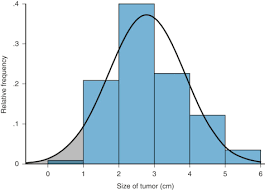
To teach the students about frequency distribution so that they can developed data in informative way and present in visualize form.
Learning Outcomes:
At the end of the session participant will be able to :
1. Understand how to arranged data in frequency table.
2. Have the idea to present data in informative way.
3. Understand the graphical presentation of quantitative data.
-
Aims/Rationale:
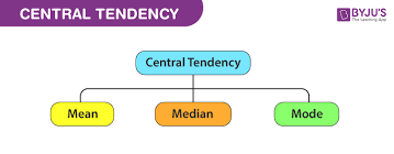
By learning central tendency students can estimate the center of the distribution in appropriate method for appropriate data.
Learning Outcomes:
At the end of the session participant will be able to :
- Interpret examples of methods for summarizing data sets, including summary statistics (such as mean, median, mode)
- Understand the applications of different types of measures of central tendency.
-

Aims/Rationale:
Students can summarize data set according to requirement and interpret it
Learning Outcomes:
At the end of the session participant will be able to :
1. Interpret examples of methods for summarizing data sets, including summary statistics (quartiles, percentiles, deciles )
-
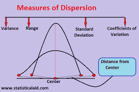
Learning Outcomes:
At the end of the session participant will be able to :
1. To determine the reliability of the data set
2. To serve as a basis for the control of the variability.
3. To compare two or more data series.
4. To facilitate the computation of other statistical measure.
-
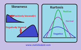
Aims/Rationale:
Students have clear concept about the type of the distribution.
Learning Outcomes:
At the end of the session participant will be able :
1. To know whether the distribution is normal or not
2. To have the idea about the nature and degree of concentration of observations about the mean.
3. To know the empirical relation of mean, median and mode are based on a moderately skewed distribution
4. To know the direction and extent of asymmetry in a series and permit us to compare two or more series with regard to these.
-
Write down the condition/s when a distribution is either symmetric, positively skewed or negatively skewed.
-
Exercise:
Set A: 18, 25, 10, 12.
Set B: 32, 30, 20, 10, 20, 40
Find the coefficient of skewness and comment for both the sets.
-
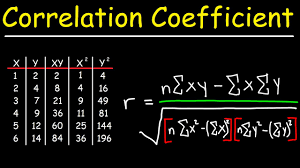
Aims/Rationale:
Students have clear concept about relations among variables.
Learning Outcomes:
At the end of the session participant will be able to:
1. Calculate and interpret the simple correlation between two variables
2. Determine whether the correlation is significant
3. To know how to create scatter plot. -
Aims/Rationale:
Students can forecast data by using simple liner regression model and predict for the future.
Learning Outcomes:
At the end of the session participant will be able to:
1. Calculate and interpret the simple linear regression equation for a set of data
2. Understand the assumptions behind regression analysis
3. Determine whether a regression model is significant
4. Calculate and interpret regression coefficients
5. Recognize regression analysis applications for purposes of prediction and description -
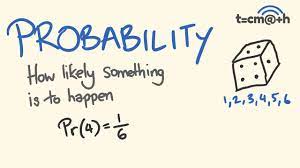
Aims/Rationale:
Students have basic concepts of probability and related mathematics.
Learning Outcomes:
At the end of the session participant will be able to:
1. Recall rudimentary mathematical properties of probability.
2. Describe the sample space for certain random experiments.
3. Explain probability in terms of long—term relative frequencies in repetitions of experiments

